Posted in: Methods - Language, mindset, process
An Introduction to Using Patterns in Web Design
By Ryan Singer •
The biggest challenge for web designers is the unthinkably huge number of possible ways to solve any given problem. We usually don't think of this because we have our habits and traditions to fall back on, but there are literally billions of possible pixel combinations for each page we make.
There is a better way to manage this vast complexity than by making big decisions up front and hoping for the best. To make better sites — sites that are functional, beautiful, and "usable" — we have to break our design problems up into small independent chunks based on the real issues within our requirements. Christopher Alexander, who came up with this stuff, calls these chunks patterns .
I'm going to show you how to sidestep your habits and assumptions and use patterns to make better design decisions. A lot of fancy stuff has been written about patterns. To be simple and clear in this introduction, I'll just call them chunks .
Step one: List your bits
Start by making a list of all the specific bits that must fit together for the web page to succeed as a whole. By "bits" I mean any kind of design consideration. So this includes what info the page should get across, what actions it should support, important attitudes of the users, and so on. Do not prioritize, group, or categorize. If you start by grouping and organizing you'll just end up with your original habits and preferences in the end.
Here are the bits for a "My Account" page that I recently designed:
- Company info
- Insurance info for company
- My (current user) info
- Other users on this account
- My sales rep contact info
- Current account plan
- Link to change search preferences
- Date account was created
- People rarely view or change insurance info
- Any user can edit anything except other users' info
- Changing password is the most likely action
- People might come here to change search preferences (which are on a separate page)
Do this on paper if you're working on your own. It's faster.
Step two: Figure out which bits relate to each other
Some bits affect each other (like 7 and 12) while others are pretty independent (1 and 9). Some bits will work out better if you think of them together and some bits will be the same regardless of the others. Put the bits into chunks based on whether they impact each other — not based on any conceptual or graphic ideas.
A: 1, 10
B: 2, 9, 10
C: 3, 10, 11
D: 4, 10
E: 5
F: 6, 10
G: 7, 12
H: 8
Let's look at C for example:
3. My (current user) info
10. Any user can edit anything except other user's info
11. Changing password is most likely action
The password (11) is part of the user info (3) and this can all be edited (10).
Notice we're not building down from our assumptions. We're building up from what we know for sure.
Step three: Prioritize
Decide which chunks are most important from a functional perspective. In other words, decide which chunks matter most to people.
It isn't necessary to reorder the whole list. Just figure out which chunks are the most important and group them loosely:
Most important: C, A, G, E
Necessary: B, D, F
Nice to have: H
Step four: Design each chunk
Since we grouped all the directly related bits into chunks, we can design the chunks independently without worrying about conflicts. This idea is the heart of Alexander's patterns (which I'm calling chunks). You can get them right on their own and then fuse them together.
Start with the high priority chunks and move down:
Sketch C
Sketch A

Sketch G

The blinky lines around G satisfy 12 by showing that it should stand out. ("12. People might come here to change search preferences").
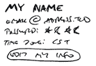
Sketch E
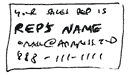
Sketch B
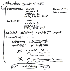
In my shorthand I've indicated that the link "Show/hide insurance info" will show or hide the block below it with Javascript. This satisfies 9 ("People rarely view or change insurance info").
Sketch D

This chunk can be duplicated for each additional user.
Sketch F

Sketch H

Notice how the above sketches use scale and weight to show priority. These decisions will guide you in the next step.
Step five: Put the chunks together
After the chunks are sketched, piece them together into a whole. Think about the constraints that went into the sketches. Think about priority. Think about balance. Do your design thing.
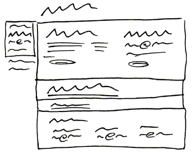
Here I did two phases. First the rough layout:
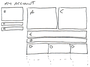
Does this remind you of a wireframe?
Next I did a loose sketch to guide my HTML prototype:
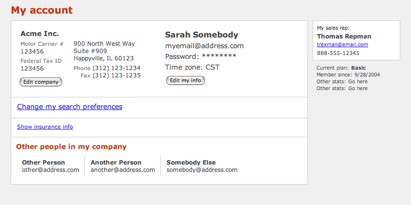
Step six: Make it real
When you build the real thing you sometimes see that what worked on paper just isn't quite right on screen. In the final design I shifted the Company data (A) around for better balance and switched the sidebar (E,F,H) from the left to the right. I could tweak these chunks independently because they were designed independently. Have a look at the result:
So much for chunks
In this article I treated patterns in a very simplified way, as chunks. You might be wondering well what are patterns then? Patterns play a significant role in architecture, urban planning, and recently software design. In all of these cases a pattern is a way of dealing with a system of interacting forces . When you find that you often design a sidebar for helpful notes, details and references, you're using a pattern. The interacting forces are the requirements of those little bits and how they relate to the main content, and the sidebar is the best way to deal with them.
(Originally posted to 37signals.com in October 2004).