Longitudinal analytics
Analytics apps don't tell you much about usage behavior. You might be able to see how many users performed an event, or how many times they did it. But none of the analytics packages out there are good at showing you how often people do things. Are they using to-dos once a week? Every day? Only signing into the app once a month but happily paying for years?
Time matters. You can't understand usage without time. So I tried exploring time series as a way to view usage data. The problem is, it's a lot of data. It's easy to count how many users have done something or not. The result is just a number: x%. How do you count how many users have a similar pattern of behavior over time?
The other challenge is intuition. You might get some kind of statistical answer to these questions. But does that deepen your understanding about the behavior? I've wanted a way to see the behaviors directly.
To that end I've been exploring ways to view time series data on user behaviors one by one and also in clusters.
Visualizing usage
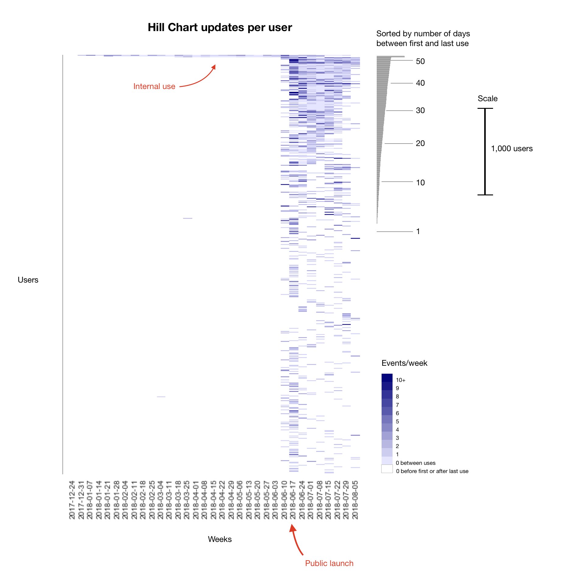
Sometimes you're totally in the dark about a feature. Is it used at all? By how many people? How much and how often? A single longitudinal graph can illuminate. Here's a look at usage after launch of the Hill Chart feature. Each row is a person who used the feature at least once. The columns are days. The chart shows the intensity, frequency, and scale of the behaviors of over 5000 people.
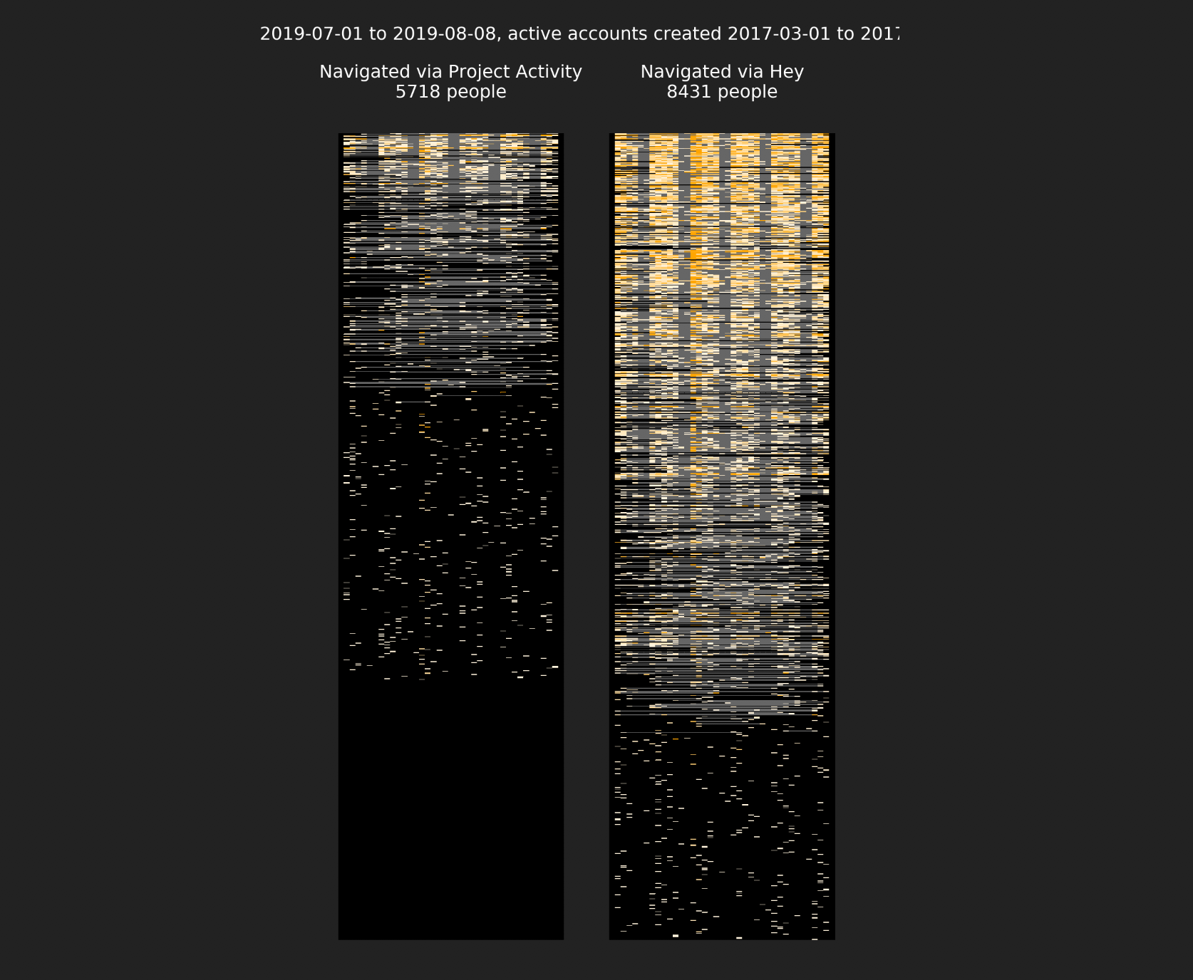
I later generalized this into a Python tool called Ginsu (internal only, not released). Ginsu takes data with two fields—creator_id and created_at—slices and dices it longitudinally, then heatmaps it. If you run multiple queries at the same time, Ginsu scales them proportional to the largest result for visual comparison. Like above, each row is a unique person and each column is a period of time (one day in the example below). The shading shows intensity of usage, from zero (black or grey) to 20+ events (dark gold) per unit time. The "snowfall" at the bottom shows people who only peformed the behavior in one time unit (day) within the sampled window. Grey lines show spans of time with no usage between usage events by the same person. Weekday behavior clearly stands out in these examples, with less usage on the weekends.
Clustering to find a specific usage pattern
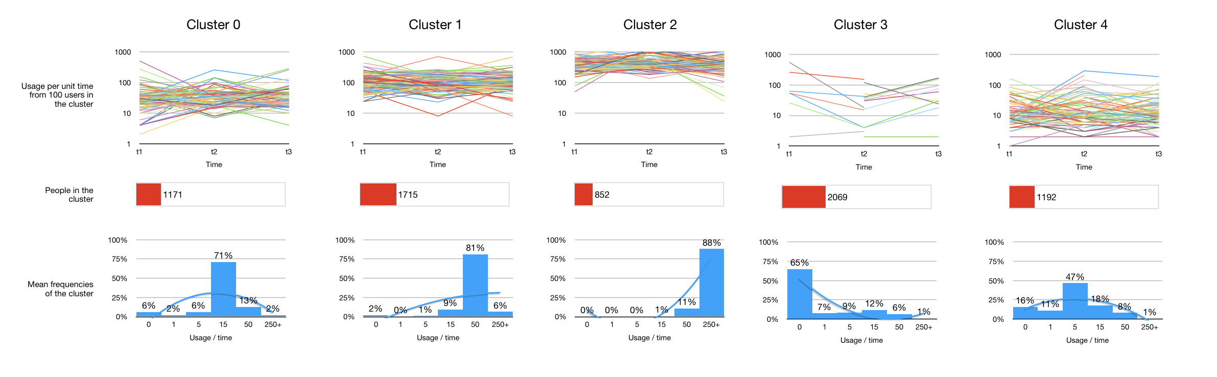
Sometimes you want to know how many customers fit a specific behavior -- like heavy daily usage. Clustering can help. Here we've taken all usage events from iOS users in a three week period, filtered by some account-level criteria, and clustered with k-Means. The clusters are shown through examples (the colored lines represent individual accounts) and through distributions (the histograms at the bottom). A technique like this allows us to recruit customers by frequency of usage for qualitative interviews.
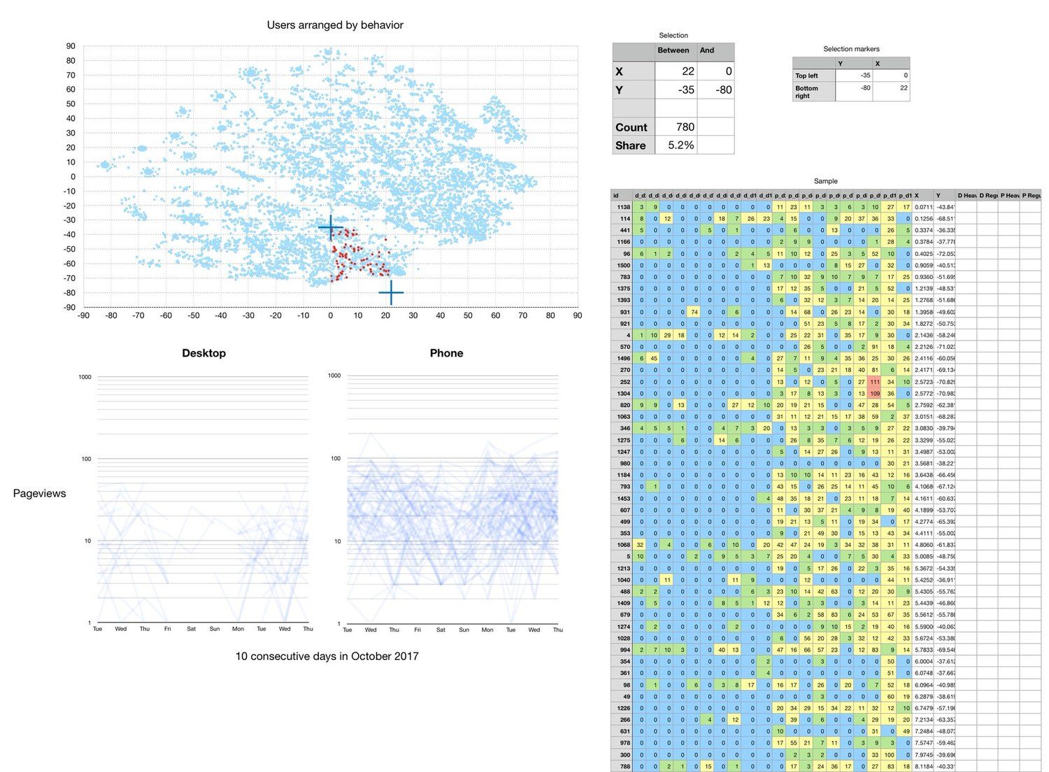
Exploring with dimensional reduction
Here longitudinal usage data is dimensionally reduced via t-SNE (principal component analysis). Regions of the reduced space are selected with crosshairs and the behaviors within that region plotted below.
In this example we've found a region of 'usage space' where customers use their phone more frequently than the desktop app.